
OUR BRAND
Edda exists to shape intentional spaces that endure, uniting bold creative vision with real world execution to deliver design build experiences that outlast trends and earn trust.
Values
Strength
Not scale. Not speed. Strength. in structure, process, and principle. We build spaces that hold up under pressure, physically and philosophically. Our strength is in restraint, purpose, and precision.
TRIBE
A trusted network. Clients, crew, and collaborators rowing in the same direction. We believe great work happens in good company. EDDA is powered by deep relationships, with trades, architects, engineers, and clients, united by aligned values and a shared mission.
GRATITUDE
We don’t take this for granted. Every project is a privilege.Every opportunity to build is earned. We approach our work with humility, knowing that each space is entrusted to us by those who believe in our vision and principles.
PROOF OF WORK
You either did the work, or you didn’t.Our portfolio speaks for itself. No shortcuts, no speculation. EDDA operates on proof. measurable effort, intentional output, and outcomes you can stand under, and stand behind.
Personality
Visionary but Grounded
We think big but build real. We exist at the intersection of creativity and execution, dreamers with dirt under our nails.
Confident, Not Loud
Edda stands with quiet authority. We don’t chase attention, we earn it through clarity, proof, and performance.
Boldly Independent
We operate with a decentralized mindset. Autonomous, agile, and unwilling to follow templates.
Intentional & Minimal
Every element has purpose. Nothing is ornamental, nothing is wasted. Like our spaces, our personality is stripped back to what matters.
TONE OF VOICE
Our voice is confident, clear, and human. We speak with purpose, avoiding unnecessary words. Every message should feel approachable, intelligent, and trustworthy.
Sharp, Clean, Direct
Say it clearly. Cut the fluff. Use strong words and short sentences. Clarity is power.
Understated Confidence
We don’t boast, we state. Our tone assumes excellence, backed by proof of work, not hype.
Poetic, When Earned
We use metaphor sparingly, with weight and purpose. When we speak lyrically, it’s to build meaning, not mood.

Technically Literate
We know how things are built. Our tone reflects a respect for detail, process, and real-world execution.
Modern Legacy
We write with a sense of permanence, language that feels timeless, yet fresh. Think classic, not trendy.

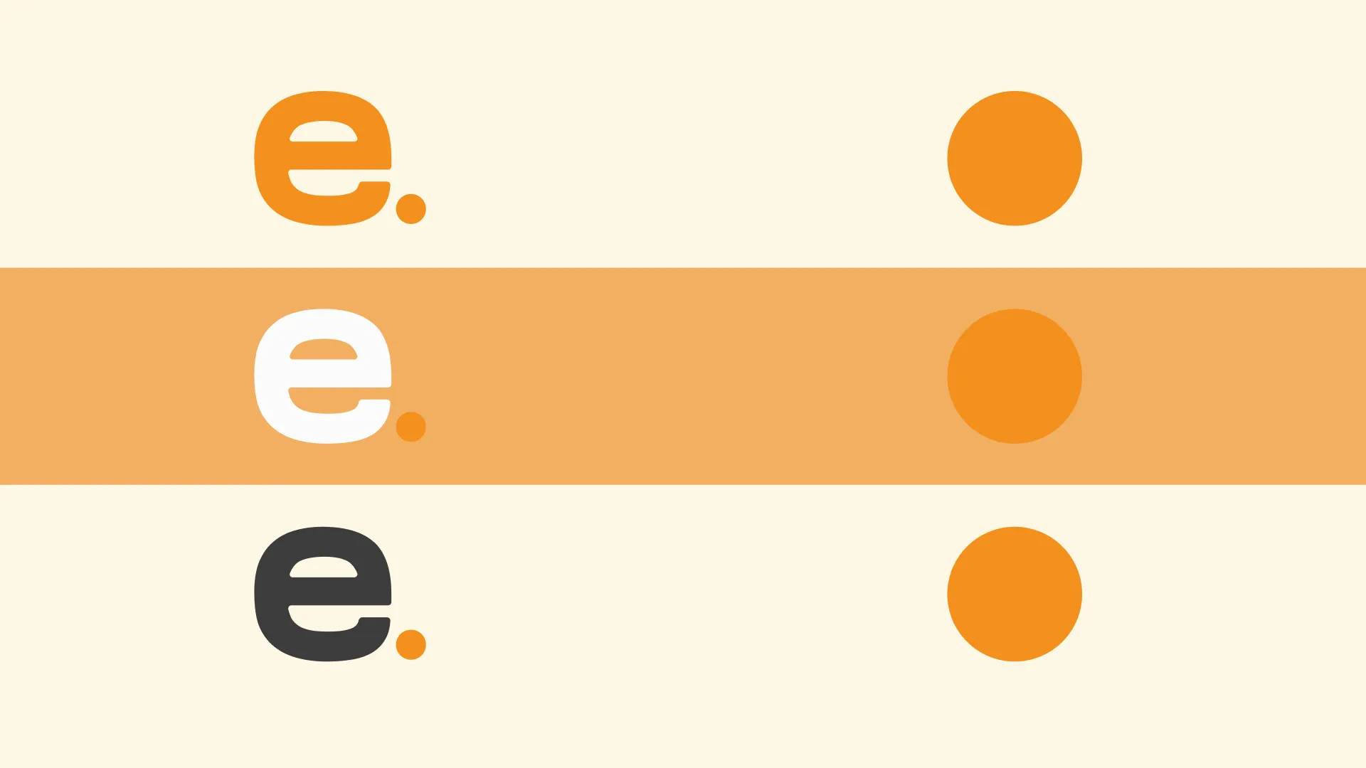
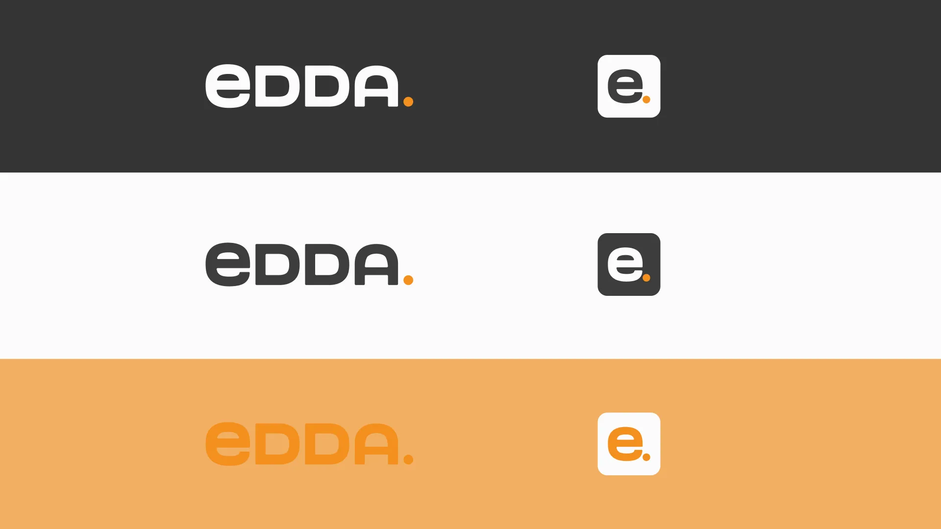
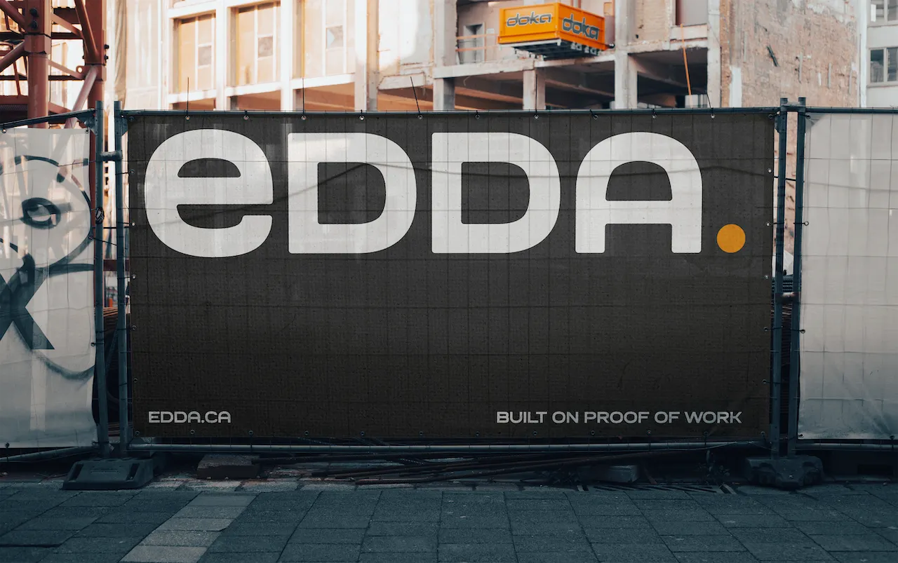
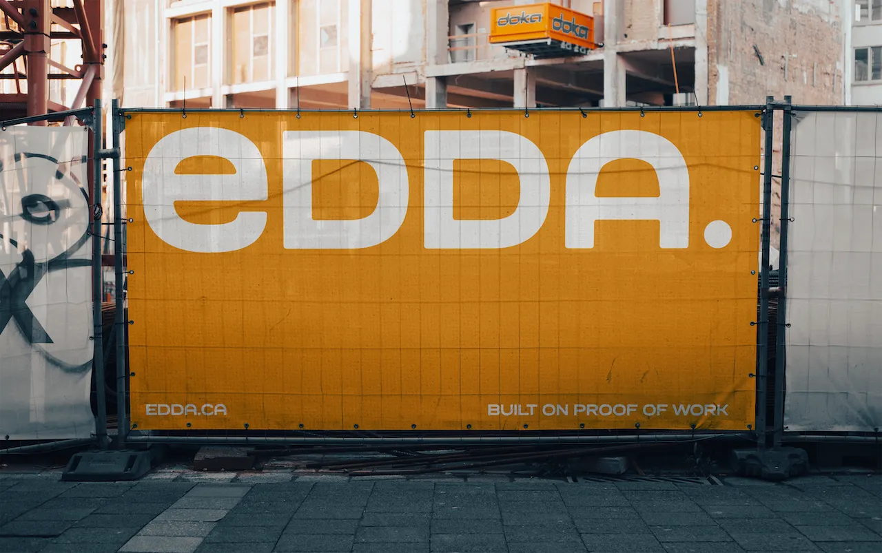
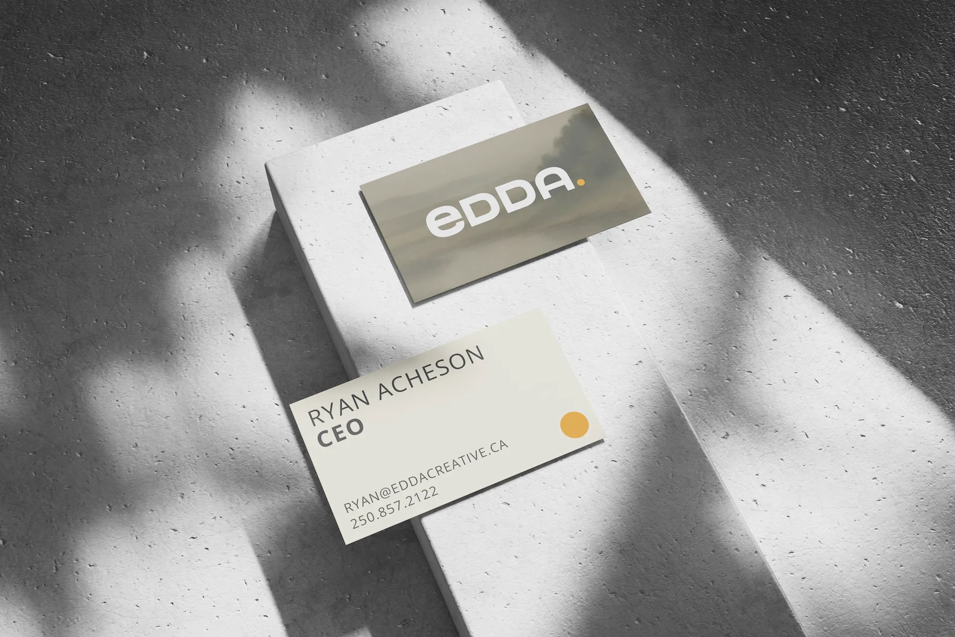
LOGO
Our logo represents clarity, strength, and trust. It should always be used consistently to maintain brand recognition. Keep spacing clear, avoid distortion, and use approved color variations only.
Wordmark
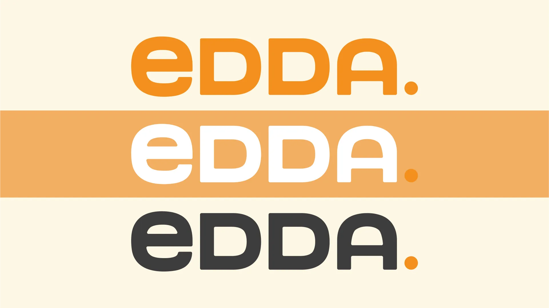
The Icon
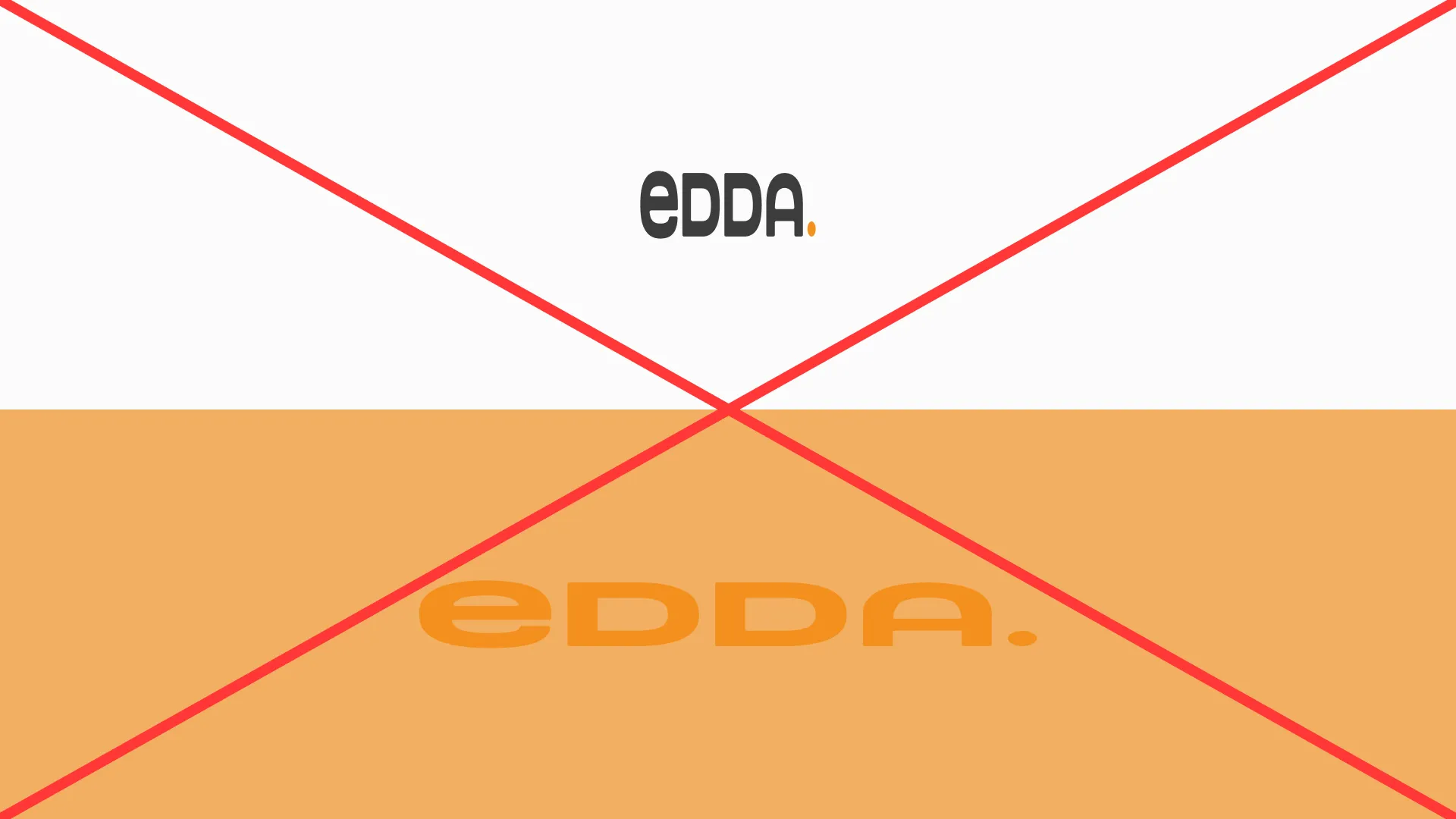
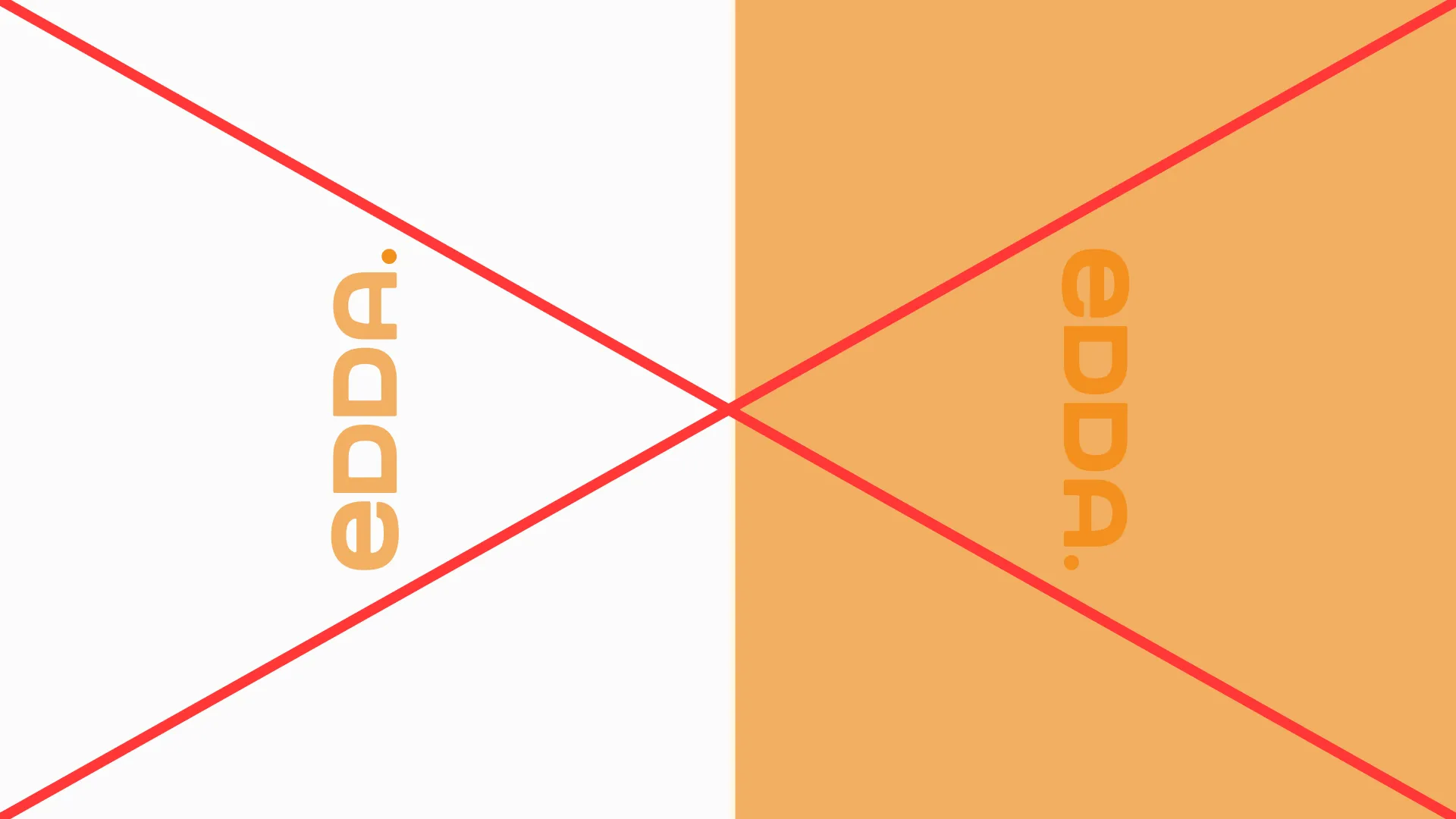
Do's AND Don'ts
Trailing Dot MUST REMAIN BTC Orange. AVOID ‘Halloween’ color combinations. Do not distort or rotate vertically.

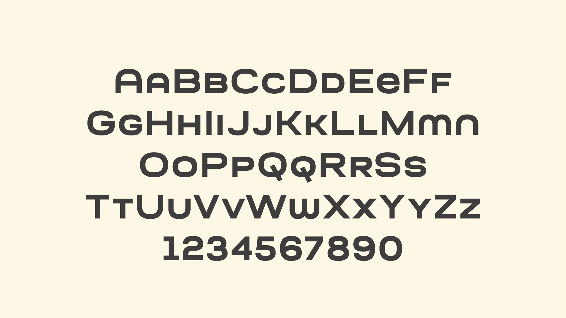
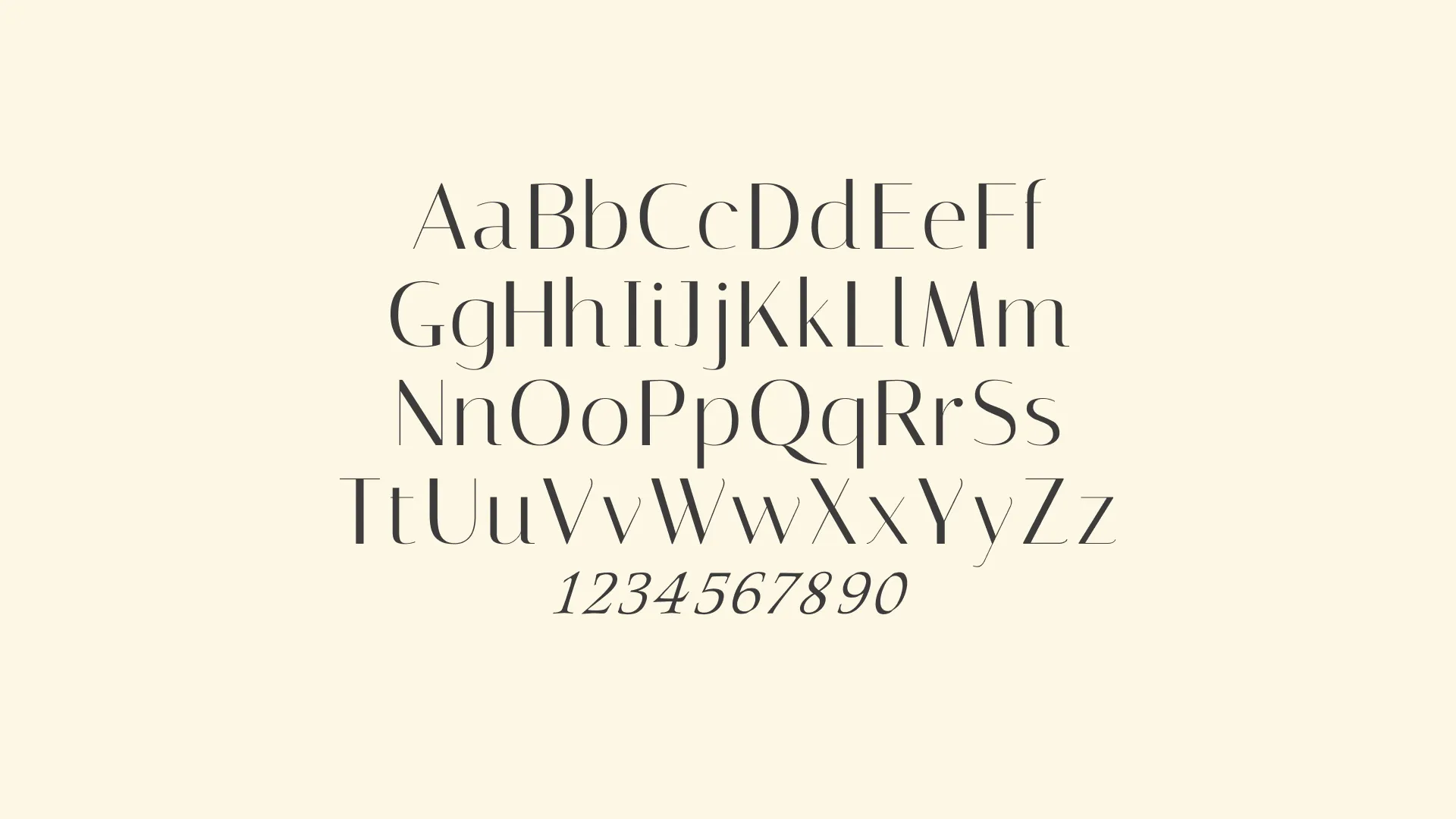
Typography
Typography plays a key role in expressing our brand identity. Our fonts are modern, bold, capitalized, and easy to read. Use them consistently across all platforms to maintain a clear and professional look. An altered Morgath was used for the logo, Open sans should be reserved for body And Subheadings, while Decorative font Italiana can be used for H1 Headings.
Morgath
Open Sans

Open Sans

Italiana
Colors
Our color palette reflects the warmth, strength, and clarity of our brand. Use the primary colors to create bold and recognizable designs, while the supporting tones bring balance and flexibility. Consistent use of these colors ensures a unified visual identity across all platforms.

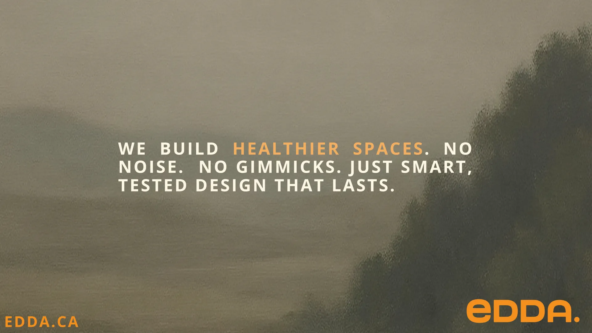
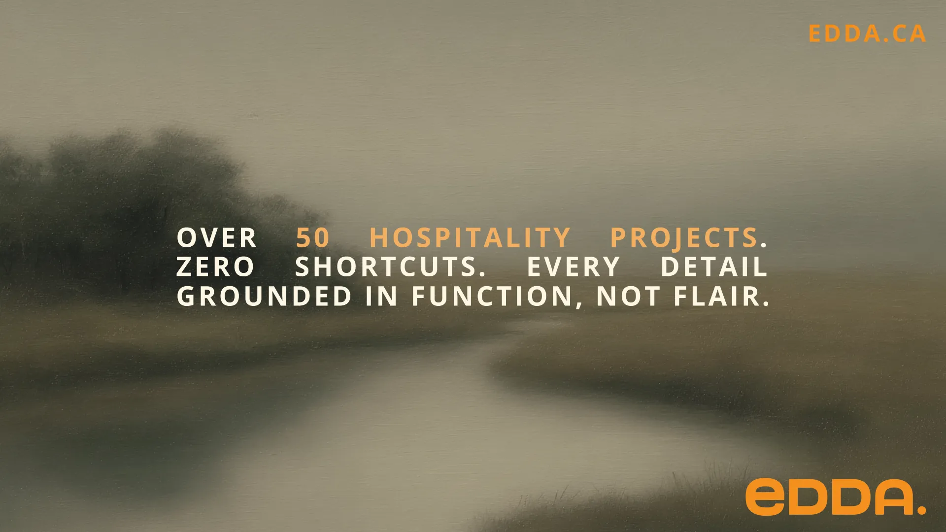
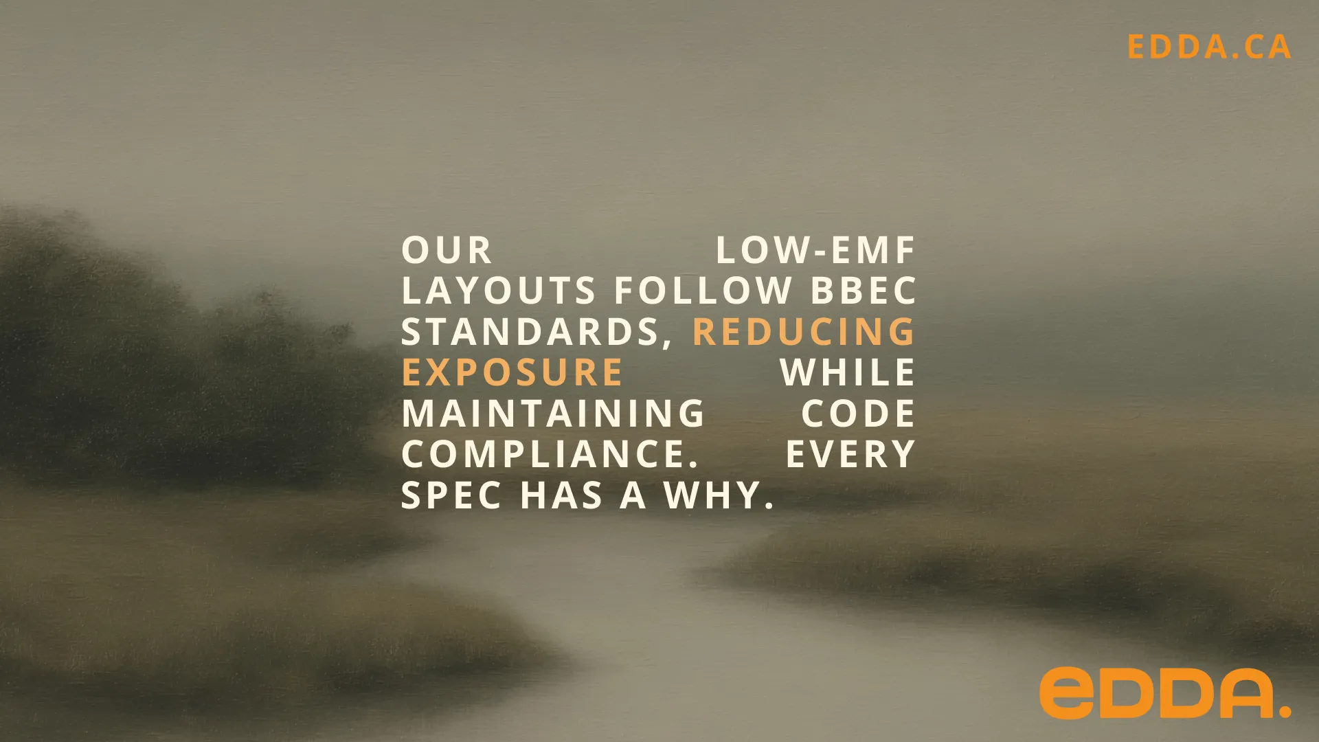
Layouts
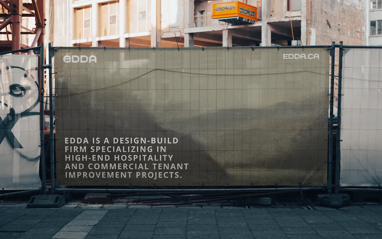
Our layouts are designed to be clean, flexible, and visually impactful. Use bold typography, balanced spacing, and consistent alignment to create structure. Photography and graphics should complement the message, never overwhelm it. Simplicity and clarity lead every composition.
Brand In Use


Social
NATIVE INSTAGRAM CAPTIONS. BRAND TYPOGRAPHY. USE OF LARGE TYPOGRAPHY TO BREAK UP FOOTAGE.